LinkedIn Settings redesign
Lead Designer (2020-2021)
As a Lead Designer, I led the long-term vision for LinkedIn’s Settings, driving both strategic and tactical design efforts. I was instrumental in shaping the product strategy by creating and presenting a compelling design vision that aligned with business goals while meeting members’ expectations. I collaborated closely with cross-functional partners to define a clear roadmap, made critical design decisions, and delivered end-to-end design solutions.
While I can’t share the complete long-term vision due to confidentiality, two key initiatives that stemmed from the long-term vision and shipped are detailed below.
  1. A visual design refresh of LinkedIn Settings, resulted in:
    • 20% reduction in the time to find specific settings, making them intuitive and accessible.
    • Seamlessly provided a consistent experience.
  2. Redesigning the Information Architecture (IA) of Notification Settings led to:
    • ~70% less number of settings
    • Unified platform experience reduced engineering time for updates, from 3 weeks to just 2 days
Settings might not be the star of the show, but they play a critical backstage role in shaping the quality of our members’ experiences. Think about it–LinkedIn is where people build their professional network, search for opportunities, and showcase their reputation. The key to a successful settings experience is simple: help them optimize and personalize their LinkedIn experience, laying the foundation for a trustworthy experience. They empower members to control their privacy, tailor notifications, and optimize their LinkedIn experience.
The goal was to empower members to have full control over their LinkedIn experience by making settings simple, discoverable, comprehensive and consistent.
Approach - layout iterations and testing
During the design phase, I worked closely with product and engineering stakeholders from the start, along with partnering with UX research in running multiple rounds of usability testing to gain deeper insights into the member journey. My process of collaboration and communication ensured that my design decisions were informed by real user data. My main focus for this initiative was simplifying information, prioritizing the most critical information and enhancing the visual hierarchy.
What got shipped
Improved navigation of settings
The new navigation improved consistency and discoverability leading to 20% time a member spends in finding a specific settings, making them intuitive and accessible. A few design decisions included:
1
Simplified information and enhance page hierarchy; added member photo for personalized touch.
2
Larger fonts, enhanced contrast, updated icons, and increased white space boosted legibility and clarity.
3
Removed settings descriptions and added a sneak peek of On/Off values, improving page scanability and discoverability.
Consistency and accessibility
I designed settings reflow and breakpoints to meet WCAG standards and work seamlessly on tablets and mobile. Designing one-experience that works on all platforms not only created a consistent member experience, but also unified the platform reducing engineering update time from 3 weeks to 2 days.
We had communication problem
LinkedIn had hundreds of notification settings under “Communications” category of Settings, and most members were unable to navigate through the poor IA.
So, I created prototypes of that experience and our research team conducted a quick test with 50 participants over UserZoom, with a set of tasks to change their settings for managing notifications. We realized a few things:
  • Inconsistent and vague settings name resulted in poor usability and comprehension
  • Members had a task-oriented mindset whereas our IA was focussed on channels (web, mobile etc.)
  • The word Communications ≠ Notifications
Approach - new content and IA strategy
First, let’s just change the setting tab “Communications” to “Notifications”. This was the first thing we shipped! 
The new IA for Communications/Notification Settings was a different approach than the settings that existed: instead of a “nested doll” flow that ends in granular individual settings, we’re grouping by intent and type. That means defining a new taxonomy (how terms relate to one another; their hierarchy) and semantics (the meaning behind terms we use).
What got shipped
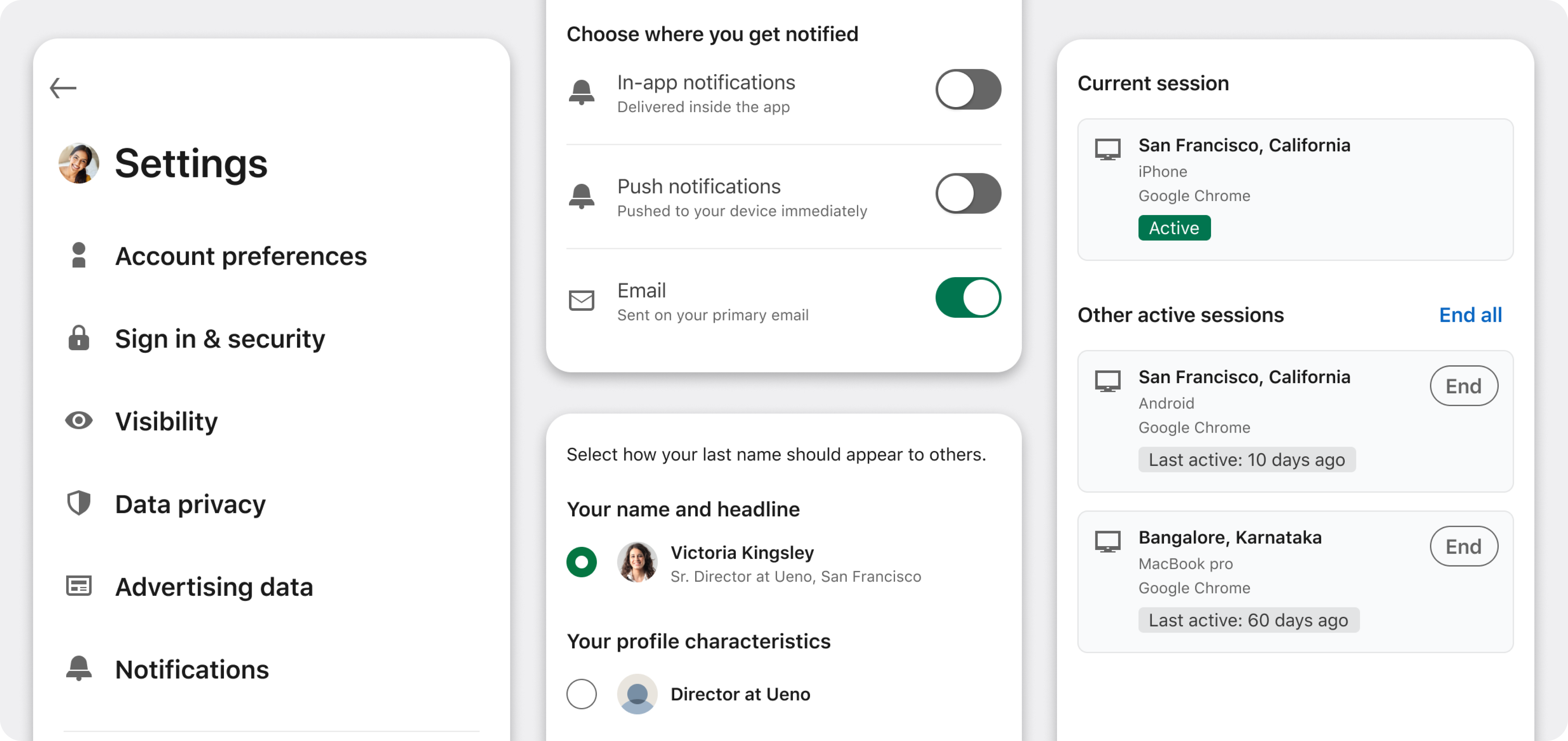
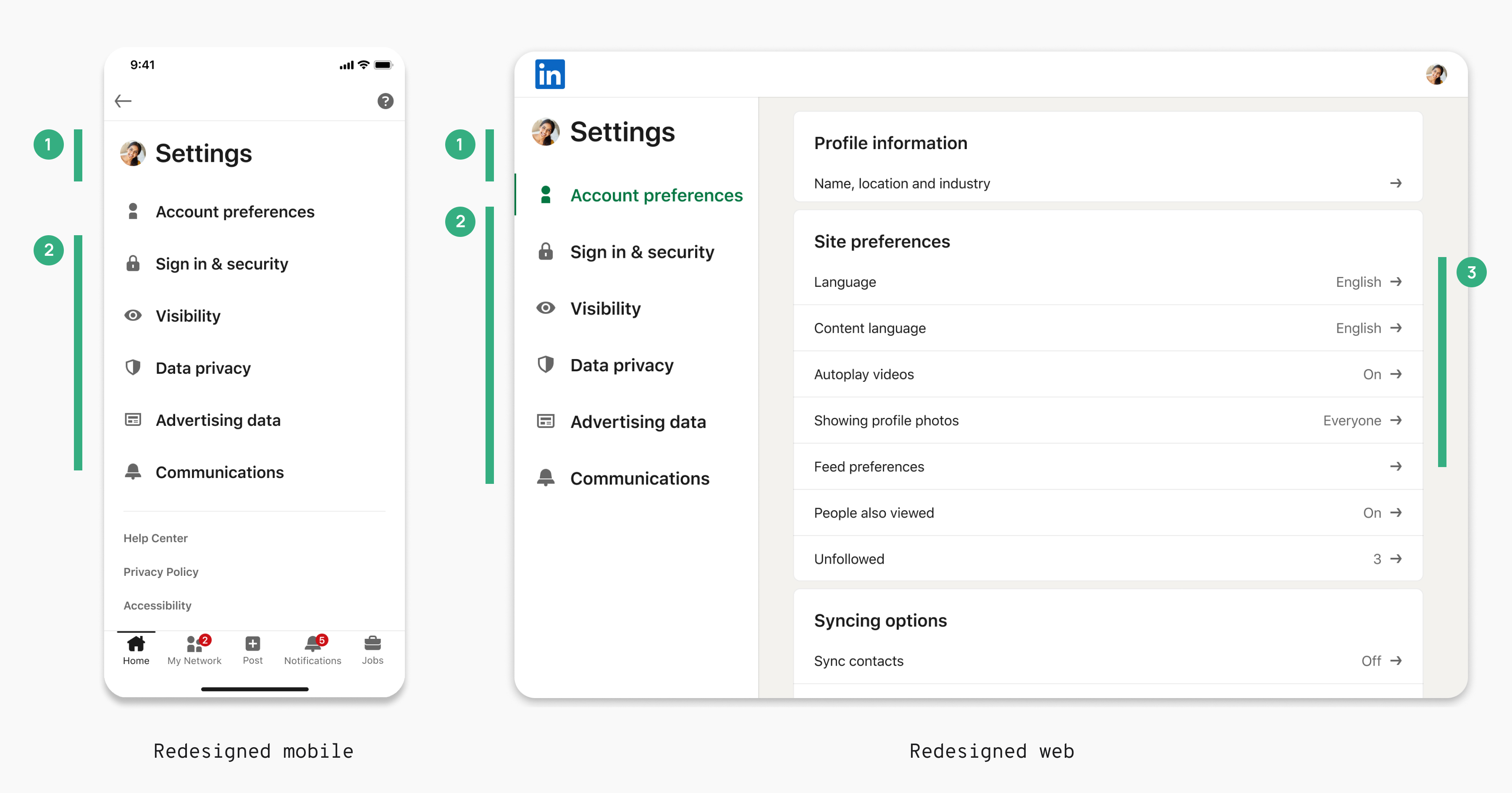
We formed a core team—PM, writer, UX researcher, and myself—and defined a clear product brief with key rituals, including twice-weekly brainstorming, internal card-sorting, and bi-weekly user testing. Through numerous rounds of iteration, testing, and stakeholder reviews, we developed a JTBD-based navigation structure that aligned seamlessly with members’ mental models, improving usability and discoverability across the Notifications Settings.
The redesign of Notification settings itself led to ~70% reduction in the number of settings on the platform and reduced engineering time for new settings updates, from 3 weeks to just 2 days.
Impact and learnings
The redesign of LinkedIn’s Settings had a meaningful impact across the product were part of a broader vision to make member controls more intuitive for members. The long-term concepts I developed sparked valuable conversations among stakeholders, helping drive a shift toward a more user-centered approach. Along the way, I learnt a few things:
  • Stakeholder alignment is crucial: Large-scale changes like an IA redesign require clear communication and collaboration to gain buy-in from leadership and get alignment with diverse cross-functional teams.
  • Balancing short-term and long-term goals: Delivering immediate improvements while keeping a broader vision in focus creates lasting impact.
  • Iterative, agile process is key: Combining frequent brainstorming, testing, and stakeholder reviews ensures the solution truly addresses user needs.